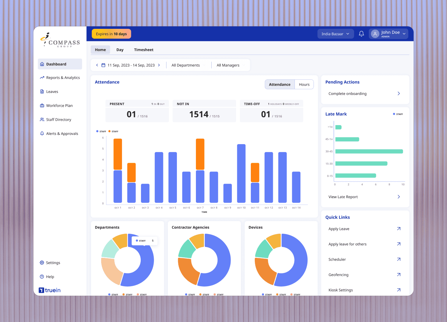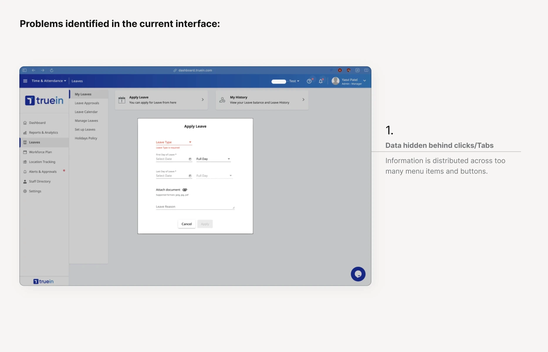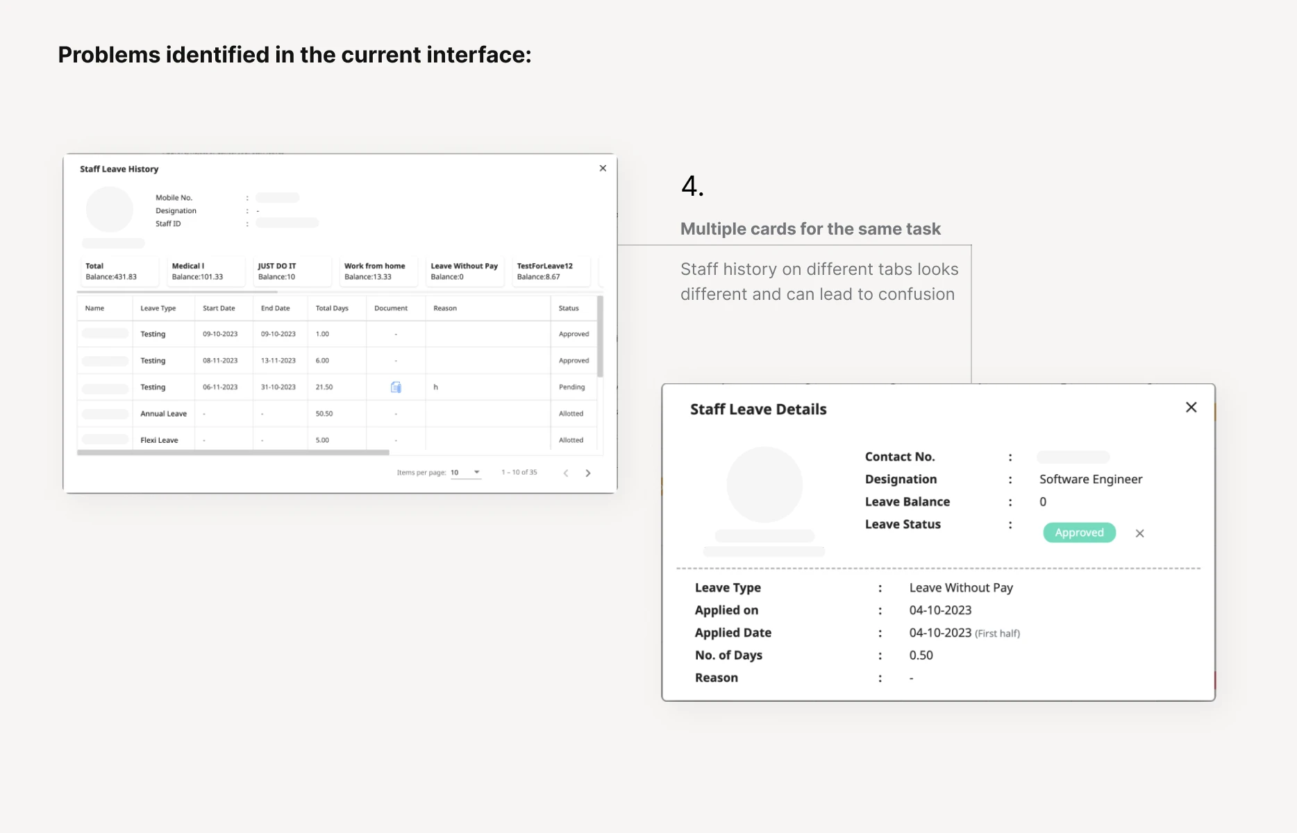
As a part of Truein’s bigger initiative of simplifying their B2B SaaS dashboard, I spent three months examining and redesigning their leave management flow. This project is a result of several rounds of iterations, interviews, audits and sending loom videos back and forth to perfect the experience for their clients. We started a second work stream to create a design system. Working with the engineers, customer success team and the product team, I focus on data visibility, architecture and interface design that reduces complexity in managing leaves.
Challenge.
Simplifying Leave Management process to reduce the complexity in managing contractual and distributed workforce.
Context.
Truein is a time and attendance startup that aims to bring transparency in management of contractual and distributed staff. Trusted by 500+ businesses across 25 countries, Truein strives to provide customizable experience for varying business processes. Consistency, easy learning curve and simplicity play a crucial role for the busy admins of these businesses to ensure quick and intuitive workforce management.
How competitors are addressing these problems
1 dashboard that shows leave application status
Apply leave button
Holiday and other policies hosted under separate settings tab
List view
Uses Tilt integration for leave management
A simple table with filters
Time-series visualization for employees
Table view
Time-off policy cards sorted in categories
Shows upcoming time-off & history on scroll
Cards under time-off show options like edit, add members/policies etc.
Cards view
1. Apply, Allot, Approve and Setup!
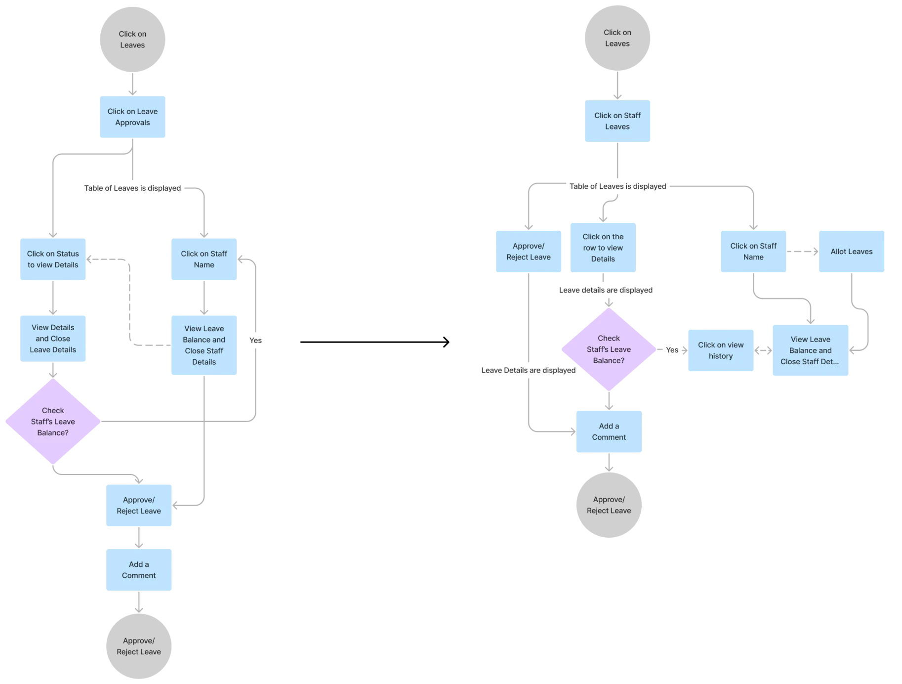
Competitor research and user feedback revealed that the most important functions of a successful leave management system are applying for time-off, approving time-offs and allotting/setting up time-off policies. Truein’s new modular system brings these use cases to the forefront! The re-imagined user flows cater to admin’s natural workflow by increasing the visibility of the data hidden behind clicks, slashing the number of clicks-to-action by upto 50%.
Approve leaves flow optimized from 9/12 clicks to 5/7 clicks
Iterating to improve data visibility and user agency
Admin can now see all leave data, add comments and view history while approving leaves
Admin can now not allot leaves if needed without leaving the approve flow
Truein Experience: Concise, Compact and Recognizable.
Based on heuristic audits and talks with the engineering and product teams, we wanted to make the experience as easy as possible for the early-adopters. Since the majority of users were converts from a tabular system like Excel, we agreed on making the new system familiar but upgraded. The new design system, focuses heavily on reducing clutter, improving visual hierarchy and inducing consistency by emphasizing recognition over recall.
2. Quick collaboration for personalized features.
Truein’s clients can request personalized features at any time during the trial period. To expedite the development time of these customized features as well as new upgrades, we documented design tokens and guidelines. The new documentation means no compromise on a consistent experience and quicker production phase!
As a founding product designer on a team, collaborating with various stakeholders was a fun challenge, This project was an immense learning experience in getting stakeholder buy-in, remote collaboration and understanding the real-world constraints in SaaS space. The next steps on this journey would be to expand the design system on Storybook and continue revamping the rest of the dashboard experiences.
Team: Designer, Engineers, Product Team, Customer Success Team, Product Owner
Timeline: 2023-2024
Tools: Figma, FigJam, Loom
Role: Founding Product Designer, UX Researcher, Prototyper, Product Component Libraries, Documentation & Guidelines, Working w/ Eng, R&D Teams, Vision work


